The 52 Week Project is a blog circle with a theme for every week (which means we all link to each other, links are found at the end of the post).
This week’s theme was the classic rule of composition Rule of Thirds. Set up like a tic tac toe board, rule of thirds is an imaginary grid that divides an image into thirds. Subjects that occupy a third, especially on line or point of the grid, have a stronger point of impact in drawing the viewer into the image.
The rule of thirds grid looks like this:
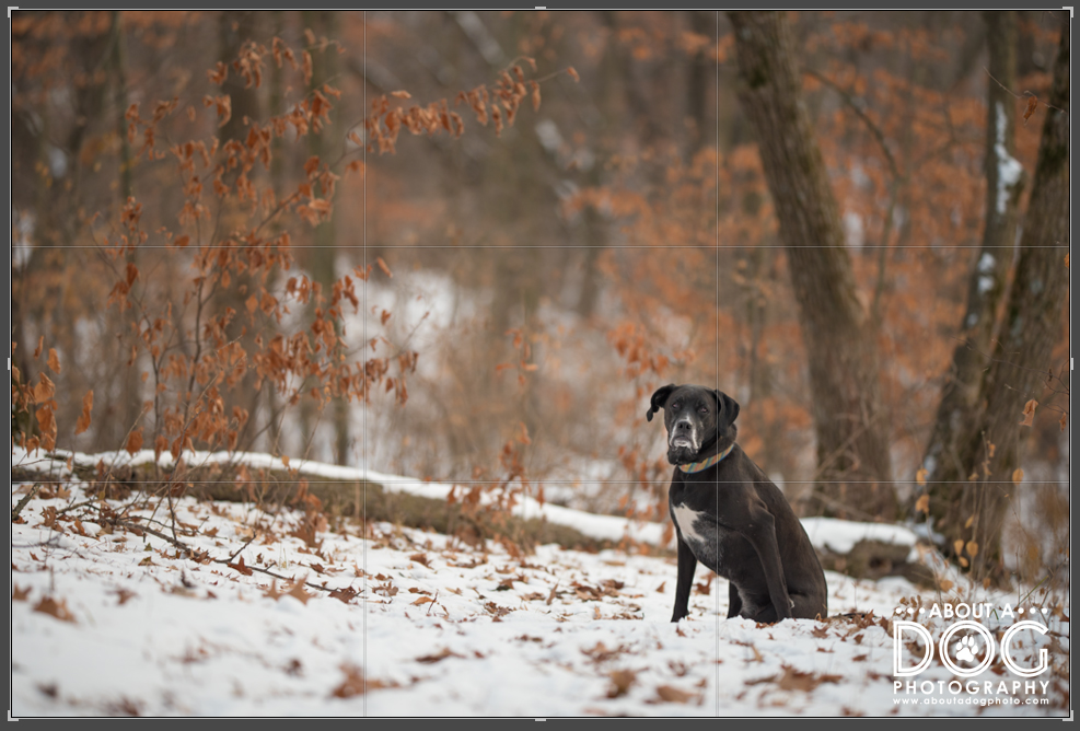
Additionally there is a rule for placing a single subject on the left hand side of the image to make the most impact (since we read from left to right – subject on the left and WA-BAM! Impact!). Pssht to this rule.
A high percentage of my images break the left hand rule and feature the subject on the right hand side of the image. We read from left to right, so it makes sense to have the negative space lead into the main subject of the image and help to convey the sense of the story and scene.
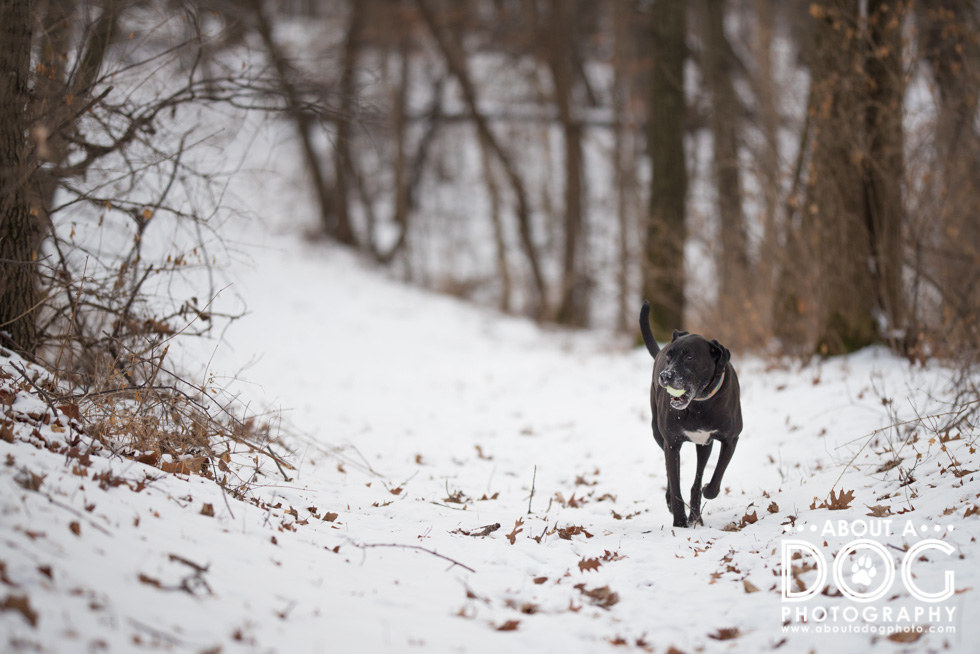
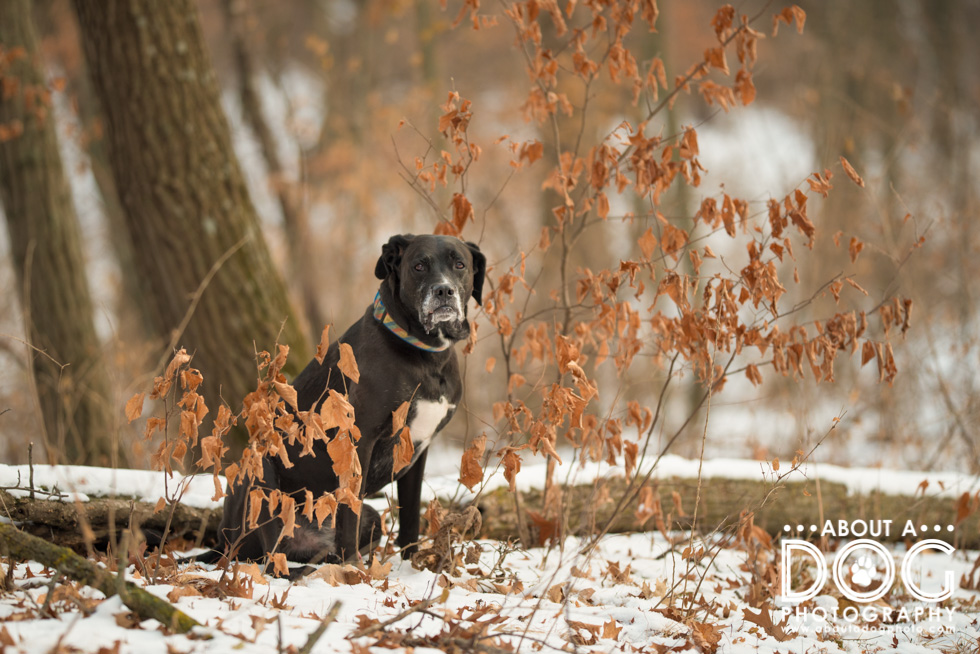
Don’t get me wrong, I’ll use the left hand side as well. (The below image is a little less of a formal version of rule of thirds as Axle is closer to the center of the image than the left side.)

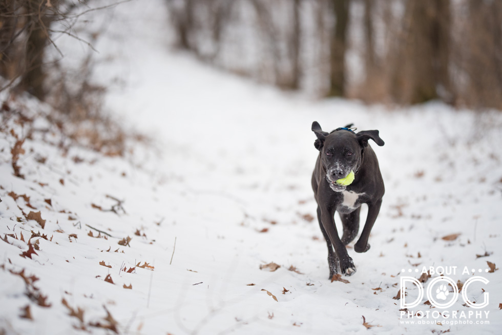
There just seems to be a better “read” to a subject on the right hand side of the image. (Its the same location as the above, Axle was repositioned a little more to the right on the path.) Do you like Axle on the left hand or right hand side of the image?
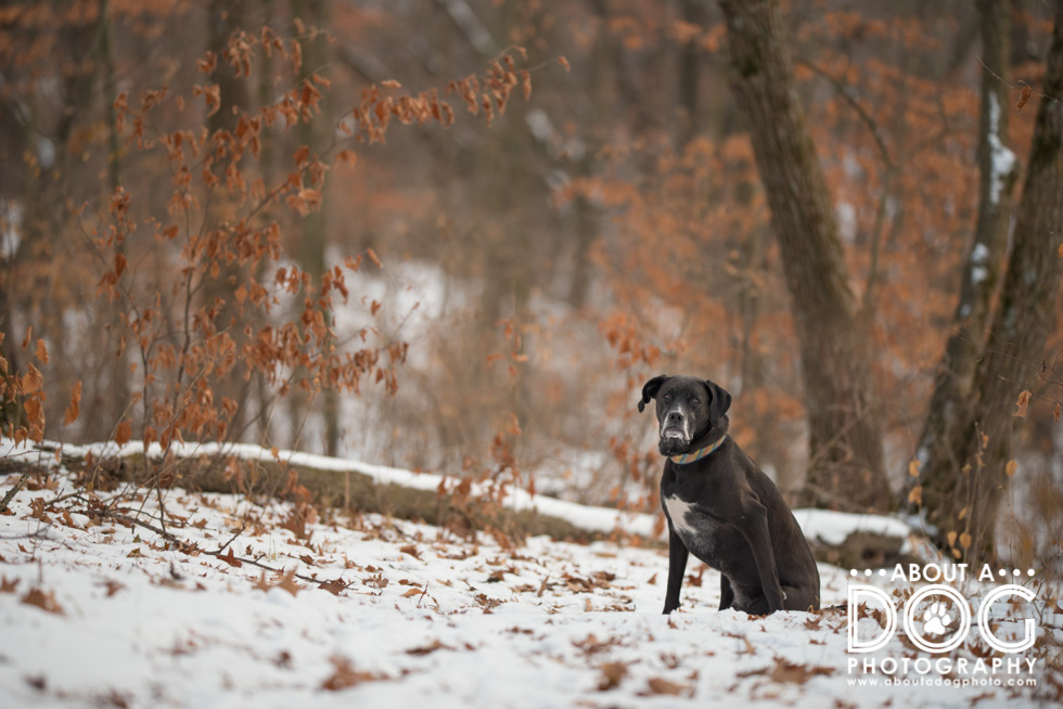
Axle and I were super happy to have temperatures higher than subzero and single digit temps (we’ve been wallowing in it since Christmas, mega ugh!) and took advantage of the mid 30s, snow and a brand new tennis ball for the rule of thirds images. (For those curious, all my images were taken on a Nikon D750 with Sigma 135mm f1.8 lens.)
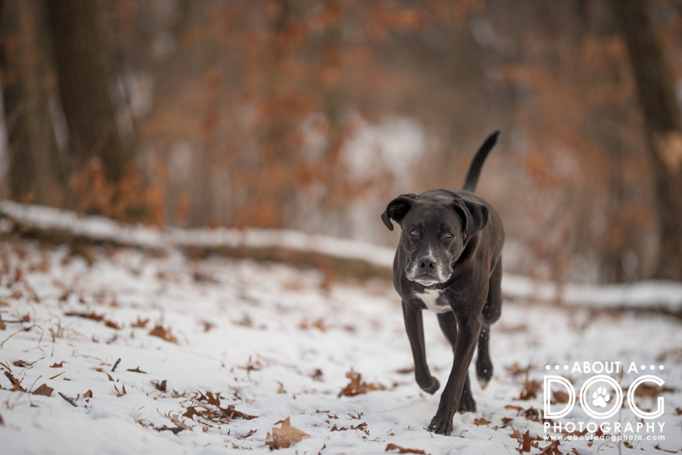
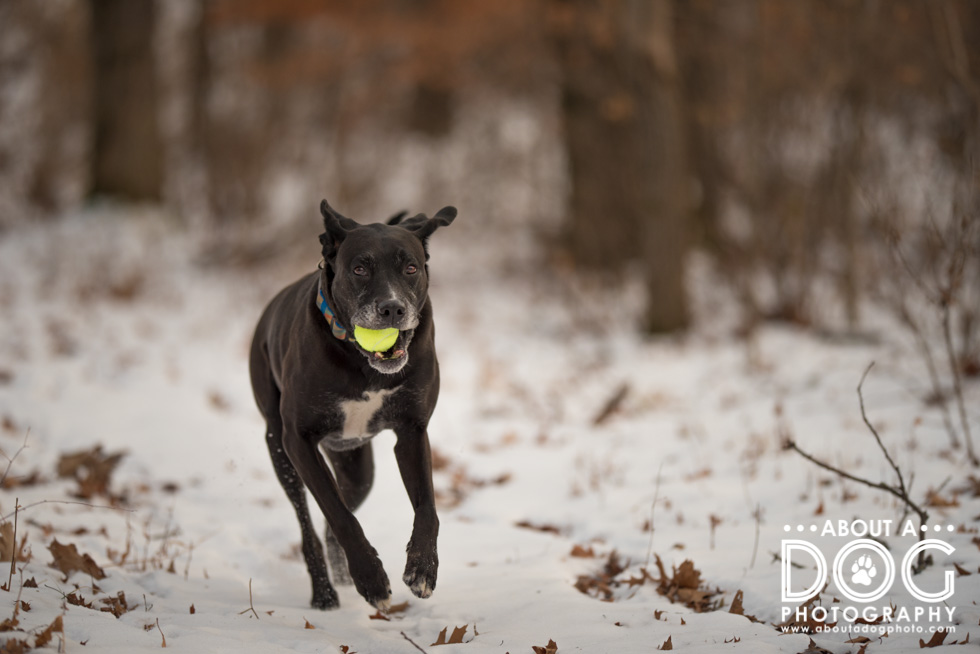

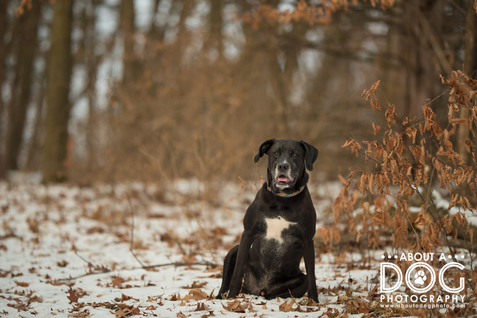
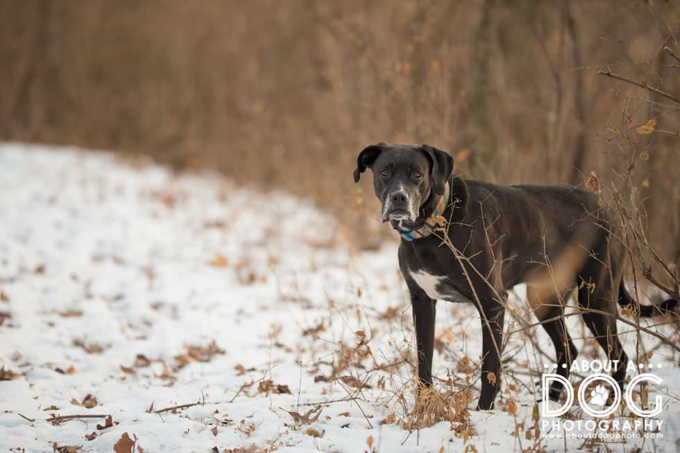
Rule of thirds isn’t just left hand and right hand sides, there are also the top and bottom thirds that can be used. I like to “push” my foreground (show more of it instead of the sky space which is typically a vertical shot with the camera tipped/angled towards my feet which makes the sky area smaller) or have a bigger sky and the ground be a third or less. The effect works well for landscapes but can be challenging to use with a dog as it can create too much sky or ground.
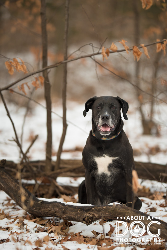
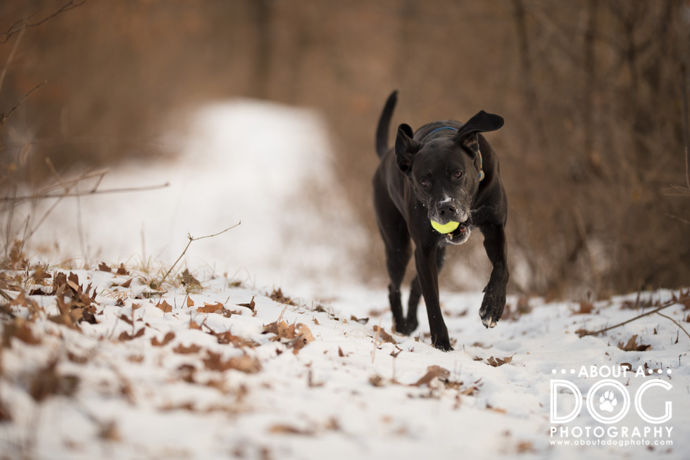
This image is an upper right hand side third (were you counting how many of the images were right hand sided in the ones above?) and it draws you right to Axle due to the rule of thirds and the “rule of sharpness” (not sure if its the formal name…). “Rule of sharpness” says the human eye is drawn to the sharpest point in an image regardless of subject and scene. In the image below your eye skips right over the blurred snow and leaves in the foreground and rests on Axle, who is not only sharp but a point of contrast against the white and browns. (Then there’s my crisp white logo haha!)
Does it mean the rule of thirds is effective in this image?
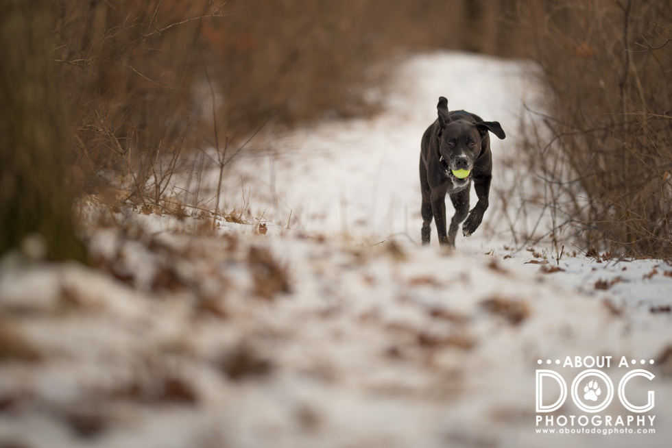
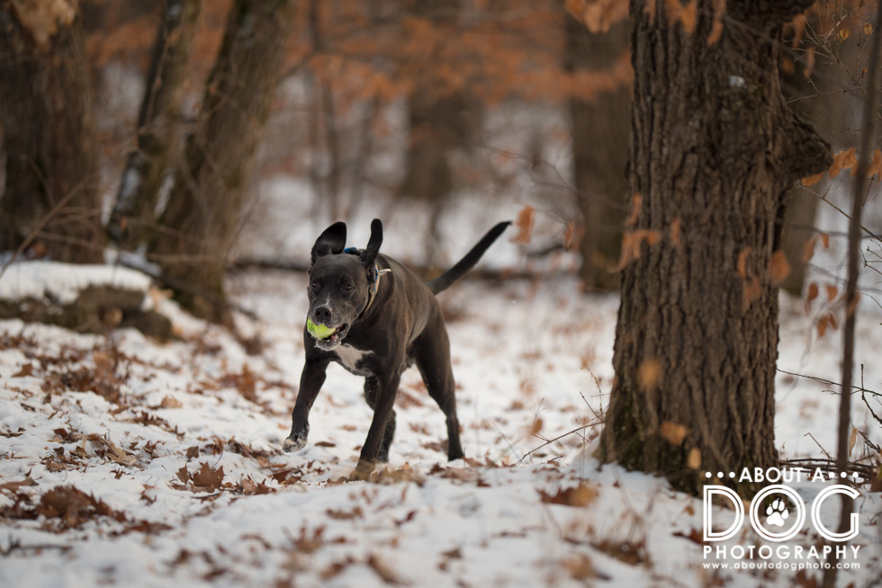
Does the above image have more impact than the below image? The location is the same, Axle is just farther up on the path and in a solid right hand side rule of thirds instead of an upper third. Which do you prefer of the two?
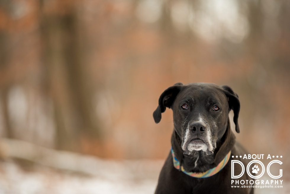
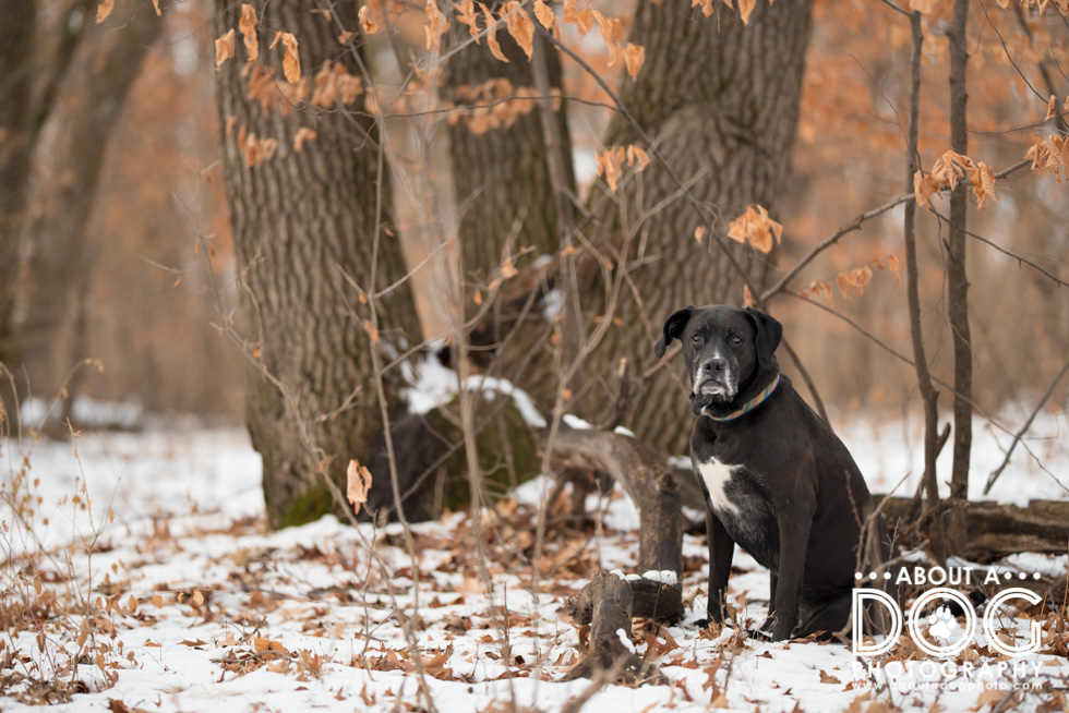
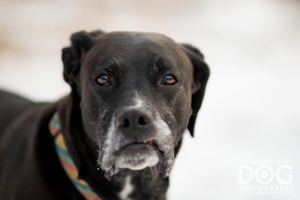
Below is more of a 2/3rds image (his left hand eye is on the left hand side rule of thirds line…) which makes the negative space a third of the image. Does it work? What if thirds not only involved the subject but the negative space as well? And if you really want some break the rule of thirds – check out these 10 myths about rule of thirds! (Just read them after you make it through the whole blog & blog circle!)

Next up visit Pet Love Photography, serving Greater Cincinnati and the San Francisco Bay Area to see how she worked the rule of thirds (and see if the others in the blog circle prefer the left hand or right hand side for their rule of thirds images!)

Great shots of Axle. Looks like it was fun getting the images. They’re great!
Wow – ok, so I have to ask – how do those of you that have your dogs in the snow keep them from having issues with their feet? We never have snow – I am in central Florida. As for your question on which photograph I like the best, I like the one where Axel is further away and I think it’s because the snow path is directly behind him in that photo vs when he is closer.
There are boots for snow loving dogs! Each dog is different, Axle doesn’t mind the snow whatsoever. My pittie Bender is a total freeze baby and acts like his toes will fall off (he stays indoors a lot in the winter).
Oh wow I love the different examples you have used! Enjoyed looking through 🙂
Absolutely beautiful! Thanks for sharing this sweet walk with Axle!
Beautiful use of the rule of thirds!
So many great photos of Axle! It’s very hard to pick a favorite. Great explanation of rule of thirds.
I love walks in the snow with my dog!. Great images.
What great examples and control of your whites and blacks. Of course Axle is beautiful (oops I mean handsome)!
Axle clearly loves his ball. He has a glow about him when he has it in his mouth.
Looks like a fun walk in the woods!
I do love the colors of the leaves that are left with the snow . Axel looks lovely in them! We had the same temps as you so glad you got a game of fetch in before the next wave of low temps.