Blog Ring

52 Week Project | Catchlights

The 52 Week Project is a blog circle with a theme for every week (which means we all link to each other, links are found at the end of the post).


This week’s theme was catchlights. Catchlights are the adorable little reflections of light in an eye. They can vary in size and shape depending on the light source they are reflecting. Catchlights help make eyes look “alive”.

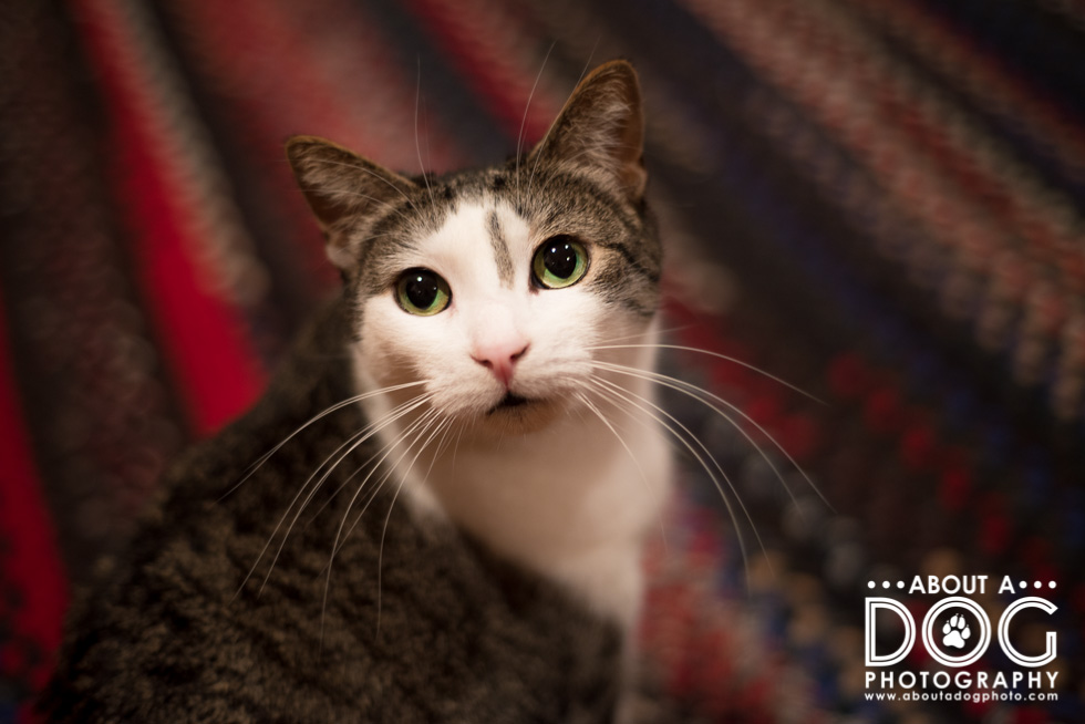
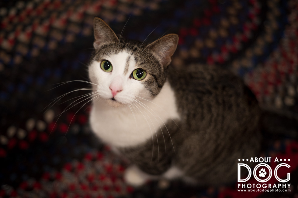
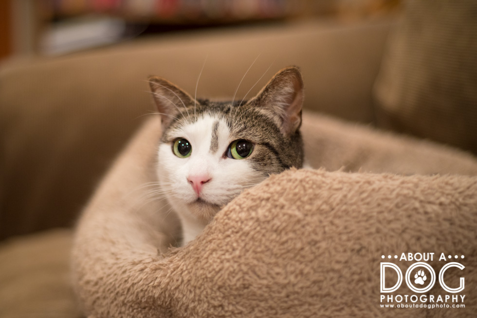
Since I had focused on Axle & Bender last week for fill the frame, this week I turned to Lilly & Tootsie, my parent’s two cats, for models. I did a two part series to capture artificial light catchlights (from the lights in the ceiling) and natural catchlights (from the windows).

First up was Lilly, the brown and white more dog than cat. She can be tricked into a look in my direction from a faux throw (she chases elastic hair ties and little spiky balls) as she anticipates said object to be thrown and sees that it hasn’t been thrown.

“Oh hi hooman…. ”
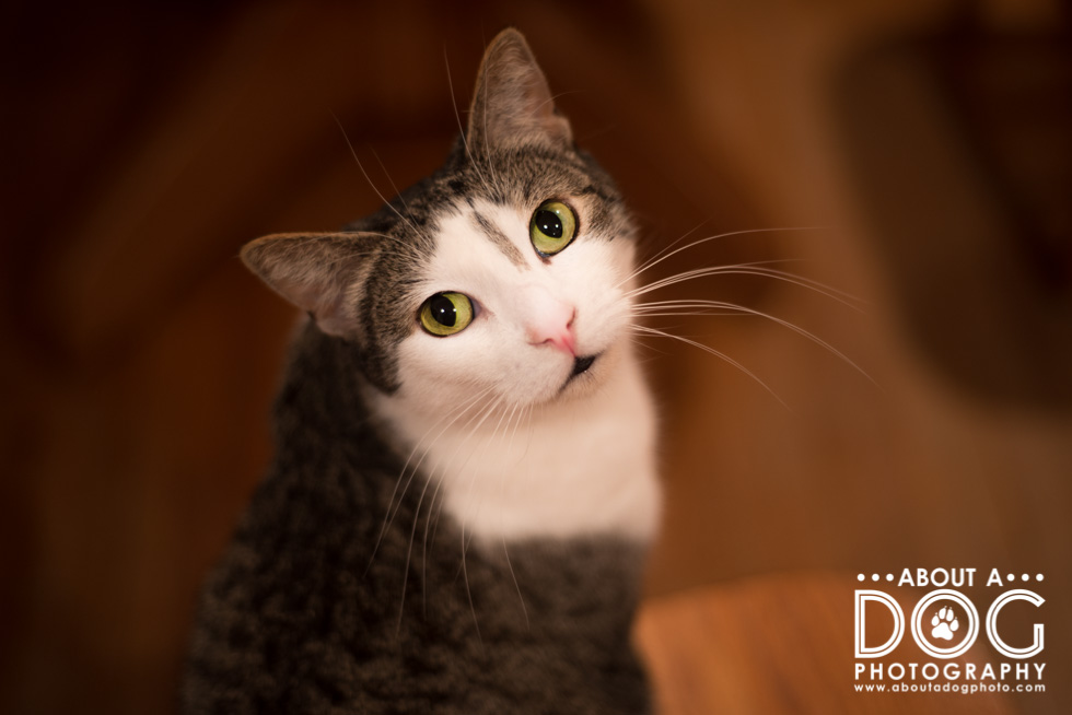
An example of how catchlights make eyes more alive. In the image below I removed the catchlights, which makes Lily look a bit creepy and sort of dead. The image with the catchlights is definitely more pleasing!

[twenty20 img1=”10876″ img2=”10877″ offset=”0.5″]
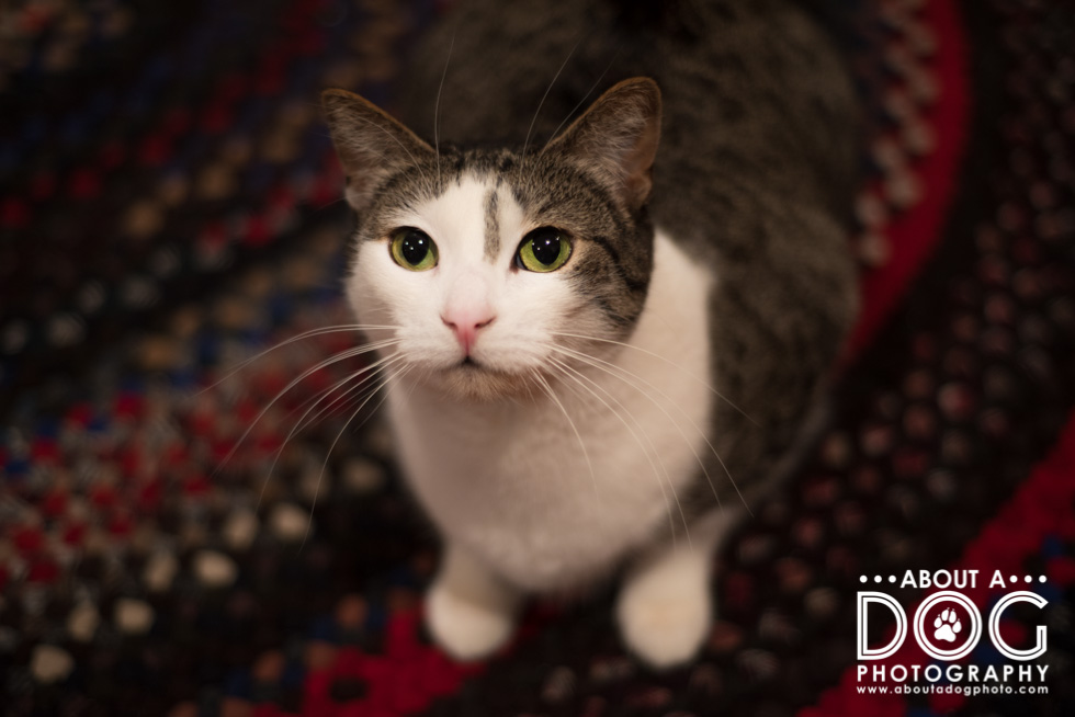
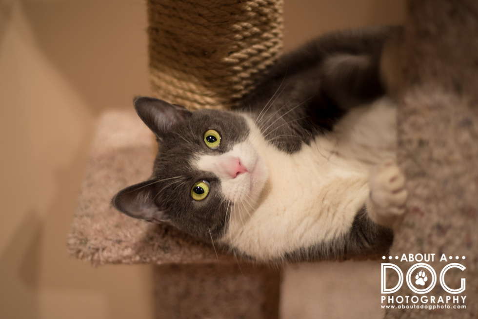
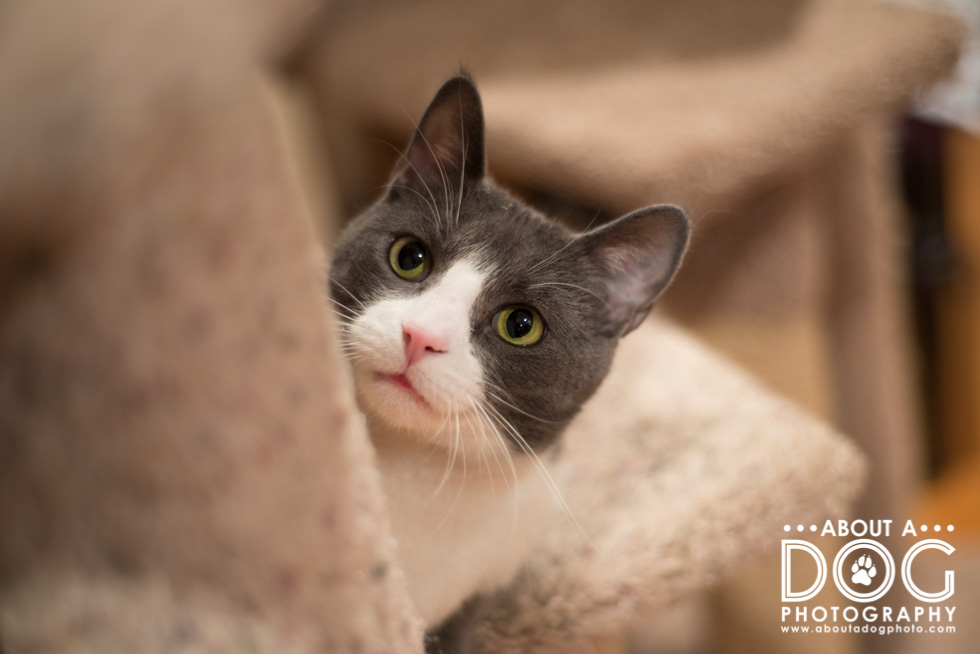
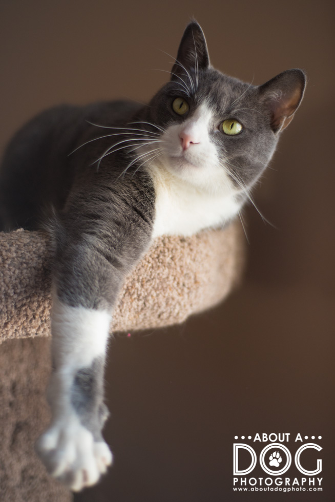
After Lilly, it was time for those split seconds of pause of Miss Monkeypants, part moose (she weighs in at 14 lbs!) Tootsie! She was situated at the top of the cat perch and closer to the lights in the ceiling. This casted some heavy shadows on her eyes and under her chin while giving her singular catchlights (instead of the “galaxy” catchlights of the image of Lilly above)
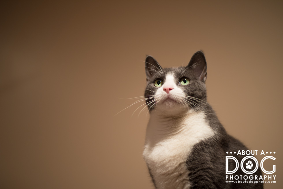
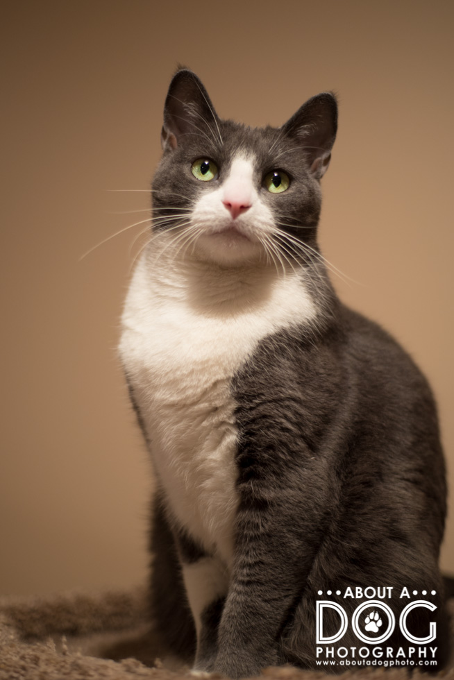
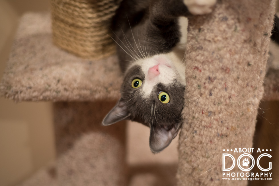
Then activate action kitty! Tootsie is a total monkey on the tiers of the cat perch. 
Lilly retired to her bed.
“Ok hooman, are you finished?”
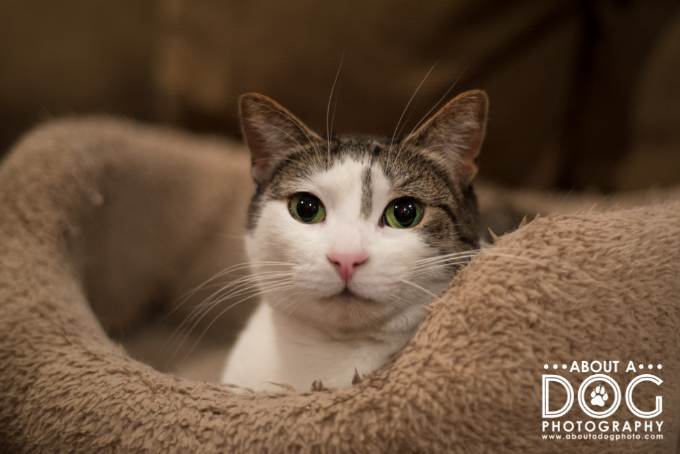

The morning came. The same rug, but this time the light was from a pair of bigger windows and the front door of the house. See the difference in catchlights?
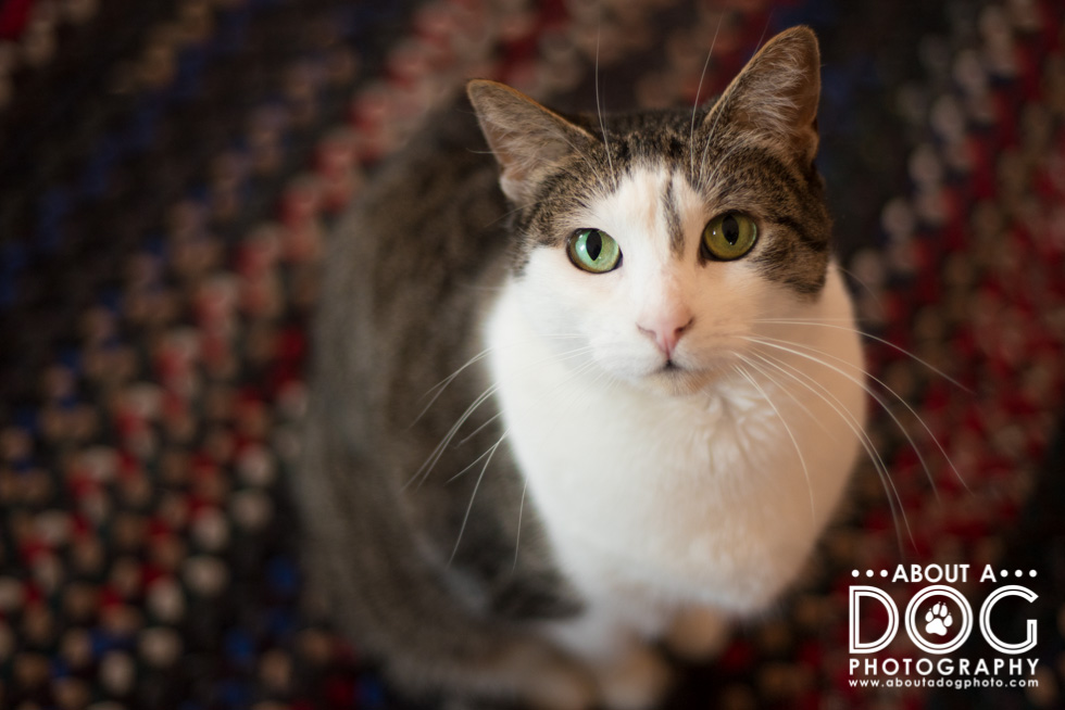
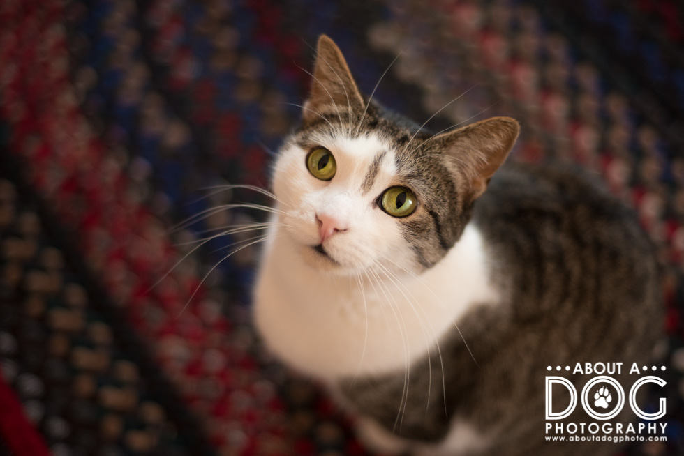
Below is the same rug and a similar pose. The artificial lights are dot catchlights while the natural light is more of a subtle singular light. Plus look at the difference in her pupils!

[twenty20 img1=”10879″ img2=”10888″ offset=”0.5″]

I had an actual ponytail holder this morning which had Lilly’s attention. In classic Lilly manner, she chased the ponytail when I threw it, but did not pick it up and bring it back. When the ponytail is picked up Lilly has already

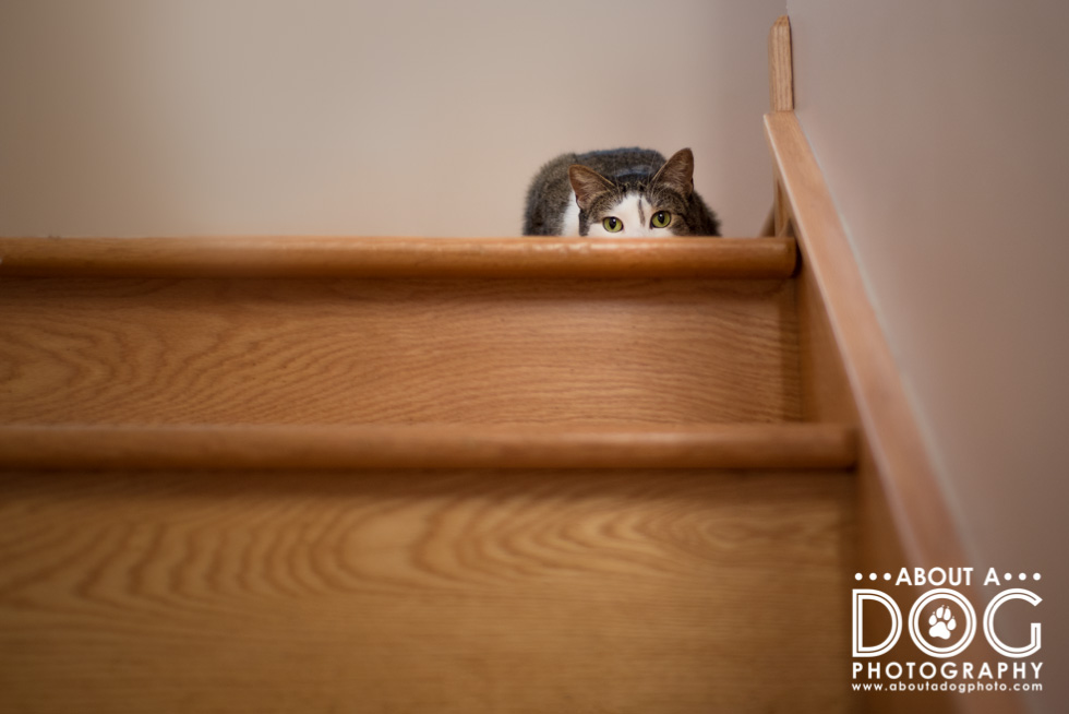
moved up the stairs to pounce. After she gets it, and leaves it on the stairs, she then moves up to the landing.
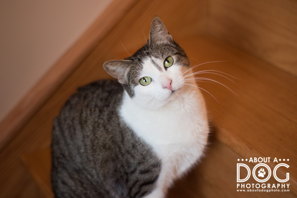
And crouches into a classic cat stalking pose.
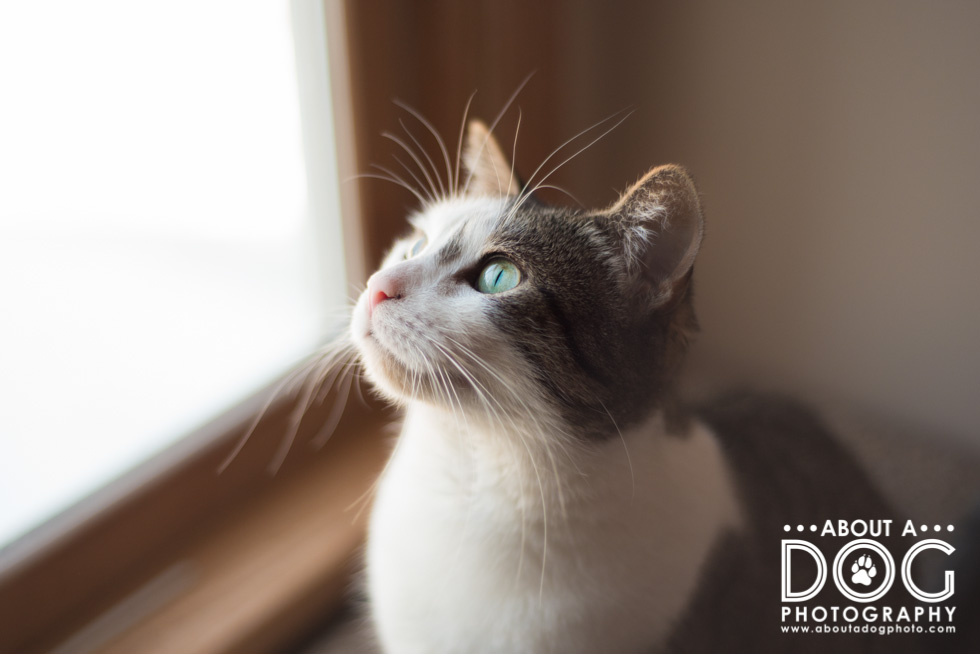
Tootsie was awake, though much more mellow than the monkey pants she was the night prior. You can see out the window in her catchlights! (The soft haze on the left side of the image is from my 50mm f1.8D lens – yay flare!)
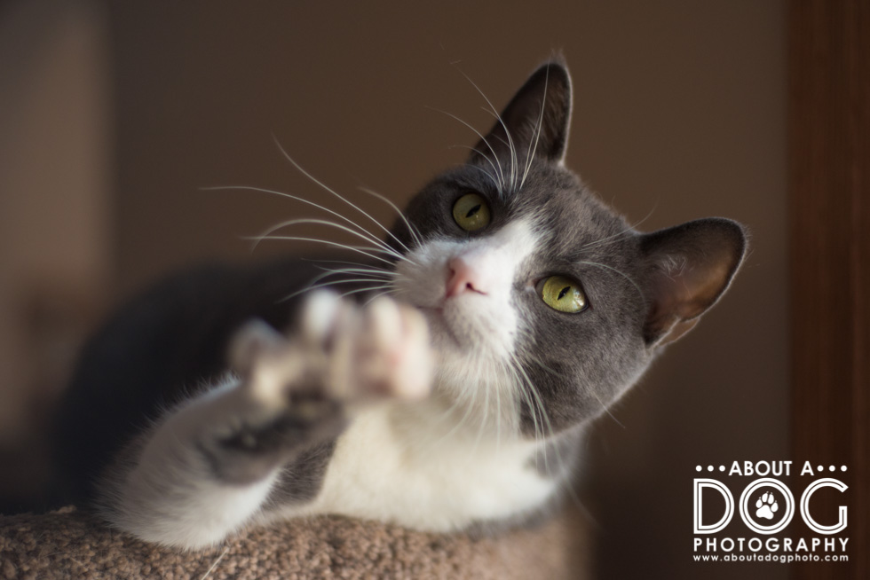
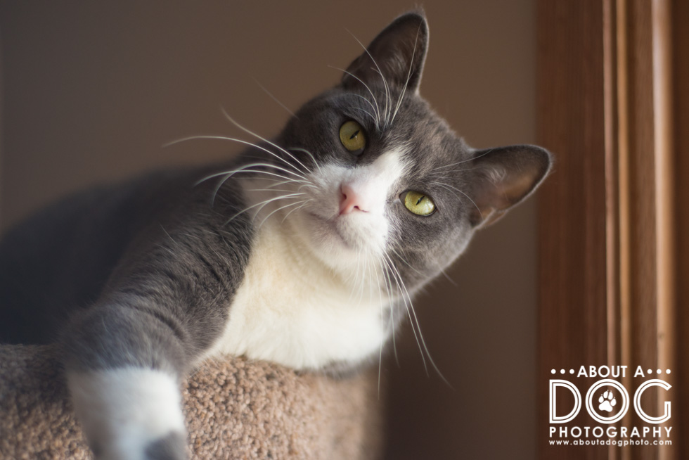
Lilly and the window catchlights. 
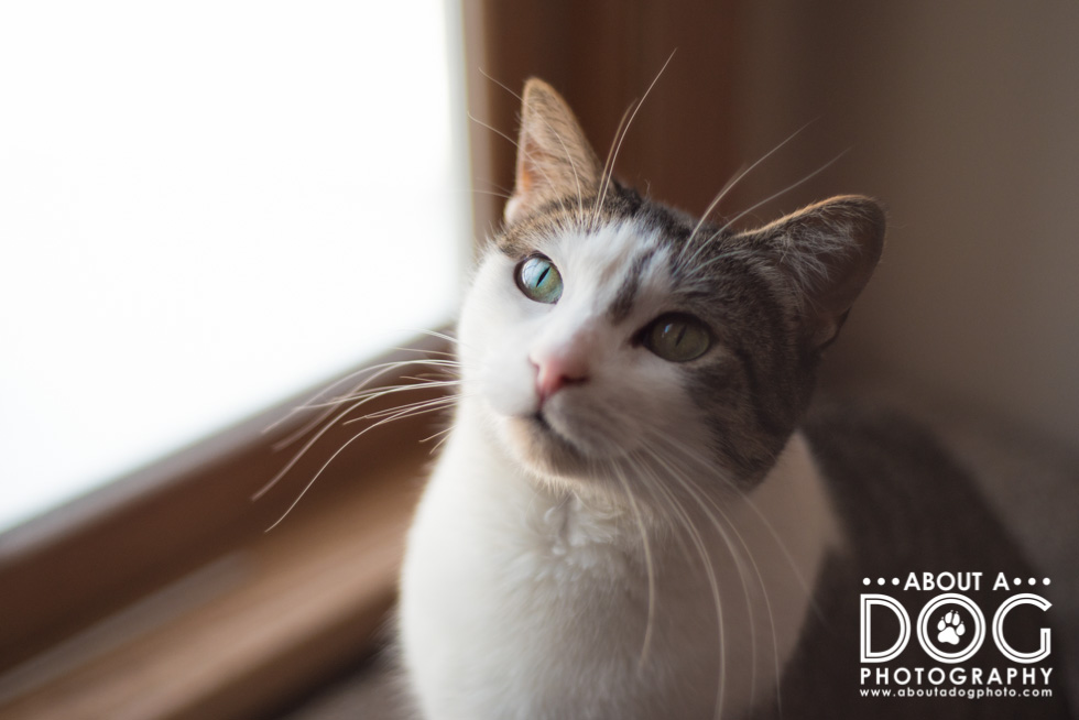
Next up see the catchlights captured by Lynda Mowat from Heartstrings Photography in Hamilton, New Zealand. Photographing pets and their people.


52 Week Project | Catchlights Read More »

52 Week Project | Fill the Frame

The 52 Week Project is a blog circle with a theme for every week (which means we all link to each other, links are found at the end of the post).


The theme for this week’s 52 Week Project was fill the frame. It literally means filling the frame of your image with your subject. This can help ward off distracting backgrounds and focus on emotions or elements in the image.

Filling the frame isn’t my fondest rule of composition. I much prefer breathing room and a scene to the image vs a tight edge to edge image, plus I like seeing a dog’s full head with nose and ears. If I fill the frame is a tight image of a dog’s face, especially in the eyes (or if there’s drool…).

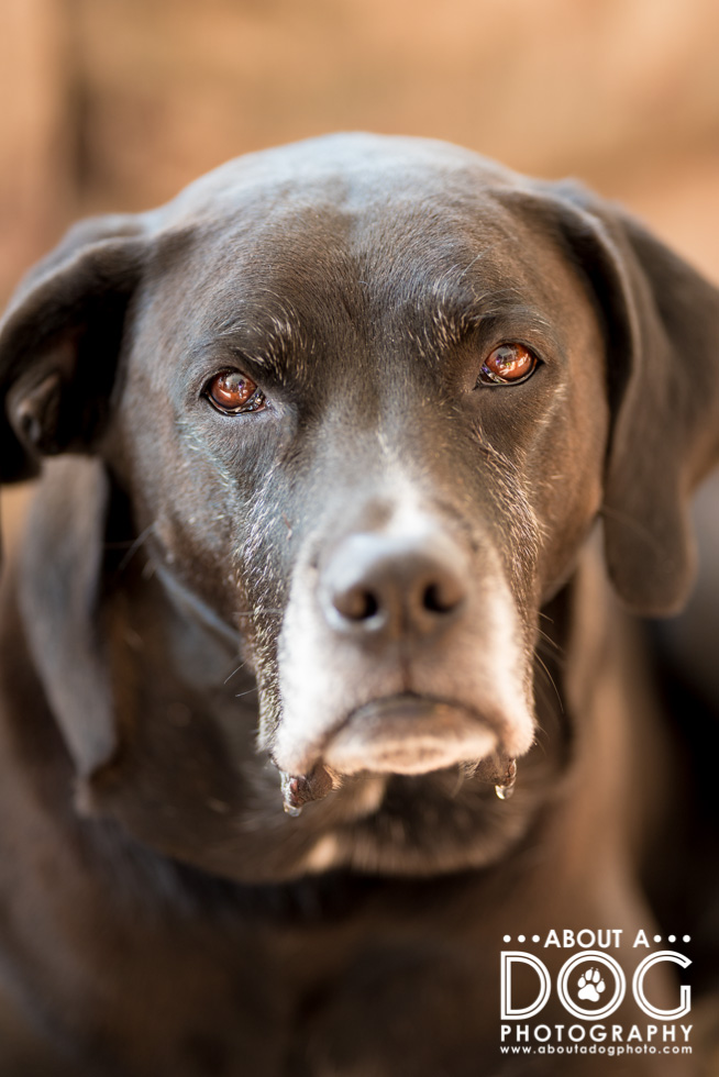
Both boys were the models for fill the frame. Bender is a bit more expressive with his ears and eyes, while Axle is much more stoic with a dash of drool.

Ok… so I didn’t really fill the frame at first with Bender. I mean, those ears! How could I not have them in the image? (He’s also sporting his “I’m on to you mom” look that happens when I have a camera and use words like walk, car ride, ready, treat/cookie…)


Bender is fun for fill the frame because it accents his eyes.

Axle (also known as Puppy) is a master of the stoic look. If there isn’t a ball involved he’s very composed, with a deadpan look and a mild movement of an eyebrow or two. His underbite makes him look like a giant grumpasaurus or a cranky old man. His only non stoic part? His drool. Introduce something tasty smelling and those jowls will drip like a leaky faucet.

Notice any difference between the first image of Axle and the one below? 

Next up visit I Got The Shot Photography, Northeast PA Pet Photographer, Elaine Tweedy to see how she used fill the frame for this week’s 52 Week theme.


52 Week Project | Fill the Frame Read More »

52 Week Project | Rule of Thirds

The 52 Week Project is a blog circle with a theme for every week (which means we all link to each other, links are found at the end of the post).

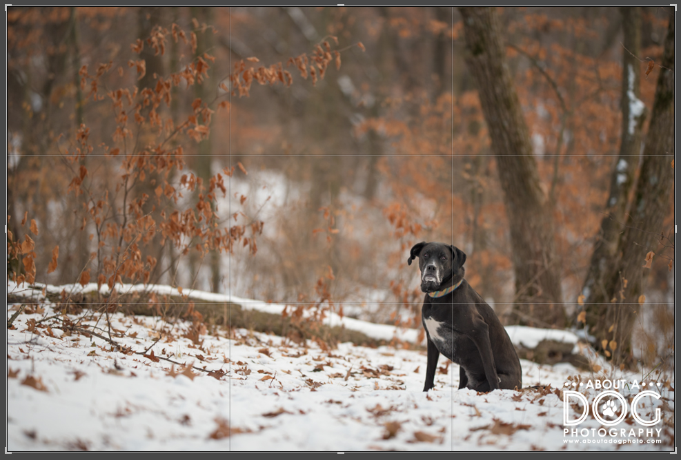
This week’s theme was the classic rule of composition Rule of Thirds. Set up like a tic tac toe board, rule of thirds is an imaginary grid that divides an image into thirds. Subjects that occupy a third, especially on line or point of the grid, have a stronger point of impact in drawing the viewer into the image.

The rule of thirds grid looks like this:

Additionally there is a rule for placing a single subject on the left hand side of the image to make the most impact (since we read from left to right – subject on the left and WA-BAM! Impact!). Pssht to this rule.

A high percentage of my images break the left hand rule and feature the subject on the right hand side of the image. We read from left to right, so it makes sense to have the negative space lead into the main subject of the image and help to convey the sense of the story and scene.

Don’t get me wrong, I’ll use the left hand side as well. (The below image is a little less of a formal version of rule of thirds as Axle is closer to the center of the image than the left side.)

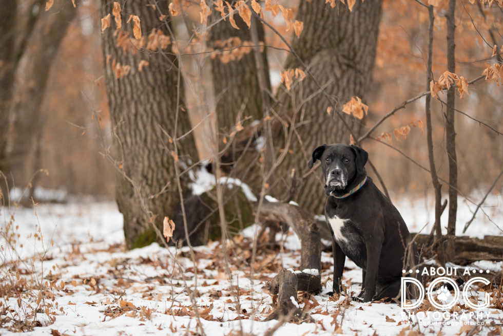
There just seems to be a better “read” to a subject on the right hand side of the image. (Its the same location as the above, Axle was repositioned a little more to the right on the path.) Do you like Axle on the left hand or right hand side of the image?

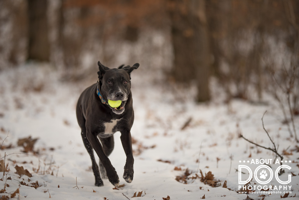
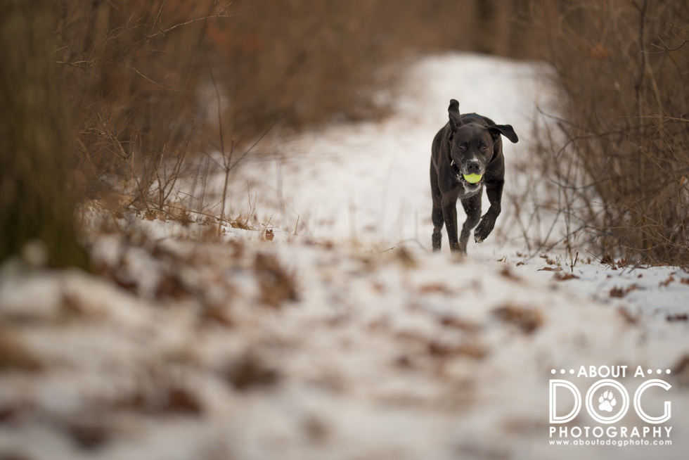
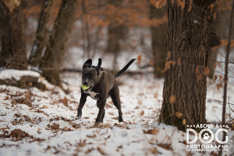
Axle and I were super happy to have temperatures higher than subzero and single digit temps (we’ve been wallowing in it since Christmas, mega ugh!) and took advantage of the mid 30s, snow and a brand new tennis ball for the rule of thirds images. (For those curious, all my images were taken on a Nikon D750 with Sigma 135mm f1.8 lens.) 

Rule of thirds isn’t just left hand and right hand sides, there are also the top and bottom thirds that can be used. I like to “push” my foreground (show more of it instead of the sky space which is typically a vertical shot with the camera tipped/angled towards my feet which makes the sky area smaller) or have a bigger sky and the ground be a third or less. The effect works well for landscapes but can be challenging to use with a dog as it can create too much sky or ground.

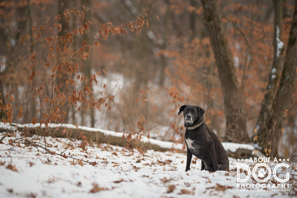
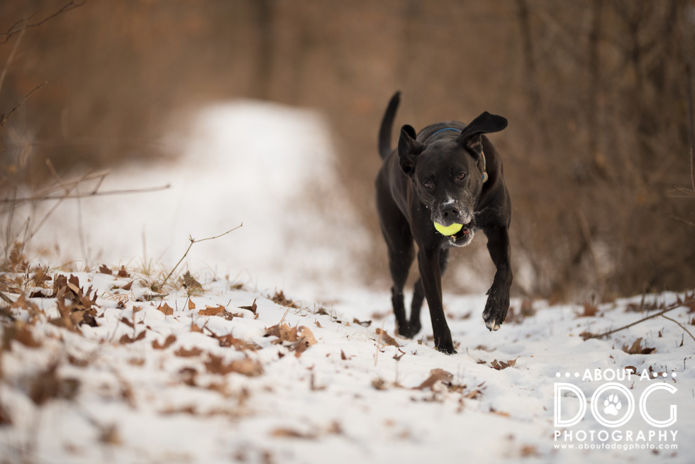
This image is an upper right hand side third (were you counting how many of the images were right hand sided in the ones above?) and it draws you right to Axle due to the rule of thirds and the “rule of sharpness” (not sure if its the formal name…). “Rule of sharpness” says the human eye is drawn to the sharpest point in an image regardless of subject and scene. In the image below your eye skips right over the blurred snow and leaves in the foreground and rests on Axle, who is not only sharp but a point of contrast against the white and browns. (Then there’s my crisp white logo haha!)

Does it mean the rule of thirds is effective in this image?

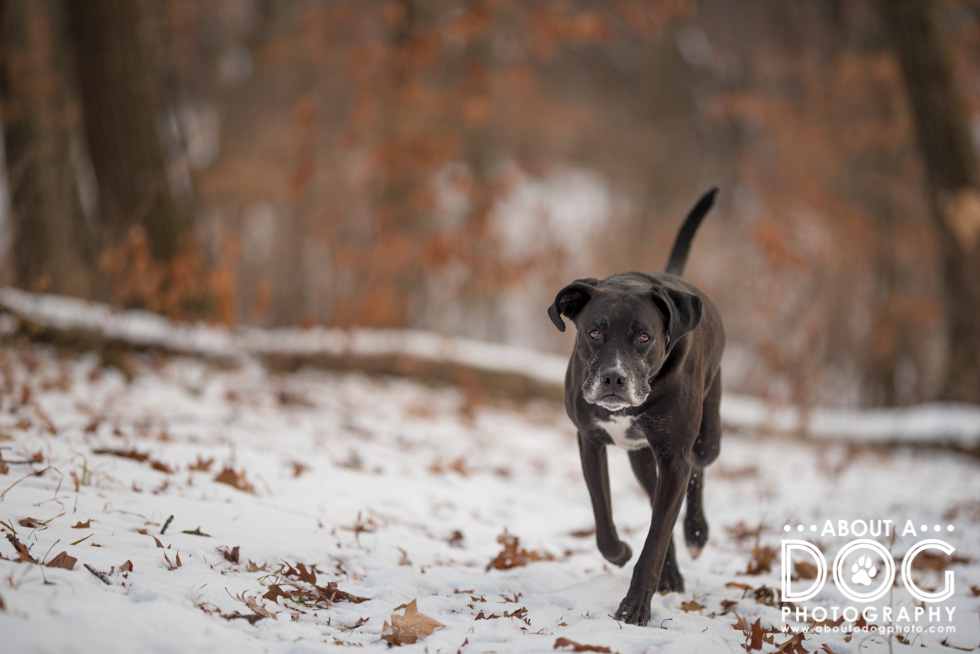
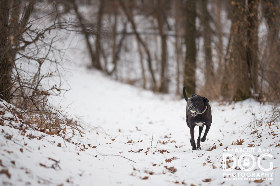
Does the above image have more impact than the below image? The location is the same, Axle is just farther up on the path and in a solid right hand side rule of thirds instead of an upper third. Which do you prefer of the two?

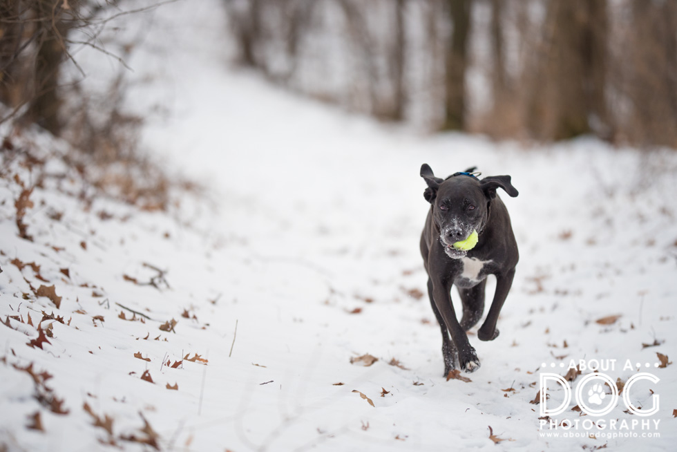
Below is more of a 2/3rds image (his left hand eye is on the left hand side rule of thirds line…) which makes the negative space a third of the image. Does it work? What if thirds not only involved the subject but the negative space as well? And if you really want some break the rule of thirds – check out these 10 myths about rule of thirds! (Just read them after you make it through the whole blog & blog circle!)


Next up visit Pet Love Photography, serving Greater Cincinnati and the San Francisco Bay Area to see how she worked the rule of thirds (and see if the others in the blog circle prefer the left hand or right hand side for their rule of thirds images!)


52 Week Project | Rule of Thirds Read More »
52 Week Project | Blank Slate

The first week into January means a fresh start to the 52 Week Project. Blank slate was the theme and fitting for the start to a new year.

I wanted to capture a portrait of “naked” Bender on a plain wall as it would be a blank slate of a background. My indoor working space is very small where the dogs are (currently I’m living in my parents’ house and due to my parents having cats, they are kept in separate parts of the house – which means using the main part of the house or upstairs is out of the question). I was able to find a 44in x 36 in space by the back door that had a blank wall without a window, but was close enough to a window for dreamy natural light and Bender would fit into.

In a manner similar to Goldilocks, it took a little to find the just right lens. 85mm & 135mm needed too much working distance…

20mm was too wide!

35mm was still a little too wide but getting closer…

50mm was just right!

Next visit Penny Whistle Photography, fetching family portraits serving Coppell, Texas and surrounding cities in the Dallas – Fort Worth area to see her take on blank slate.


52 Week Project | Blank Slate Read More »
52 Week Project | Ugly Sweaters

The theme for this week was ugly sweaters. As it so happens, No Dog Left Behind was having an ugly sweater party at Excelsior Brewing in Excelsior MN – and they had asked me to be part of the event!

(Want to see more of the event pictures? Click to see ALL the pictures!)

A few of my favorites.
Macy rocking her adorable sweater with black and white dogs!

Nico & Nala, sporting their holiday themed ugly sweaters. Plus how adorable are they as a matching pair – and no they aren’t related! They both came from different rescues in different places!

Henry & Oscar, adorable in their tinsel bedazzled ugly sweaters!

This adorable little dude (newly turned a year by a few weeks) was quite the ham! His name is Benjamin and he is a pint sized little pocket of adorable. Though he knew my ways of treat luring, so instead of going where I was trying to direct him, he stood on my leg and looked at the treat in my outstretched hand! Haha!

(See what I mean? Haha! A big thanks to my boyfriend for snagging this picture of me in action!)

Nala! The English mastiff with an impressive Elvis lip curl and a bead of drool that swung back and forth… it was mesmerizing and impressive!

And if you were curious about my ugly sweater… ta-dah! Its got… COWS on it!

Next up visit I Got The Shot Photography, Northeast PA Pet Photographer Elaine Tweedy to see what she found for ugly sweaters!


Remember if you want to see more of the event pictures… Click to see ALL the pictures!


52 Week Project | Ugly Sweaters Read More »
Scroll to Top