Ever have one of those photography themes where you can’t think of a jazzy blog title?
– Get in Line
– On Line
– On the Line
– Lining Up
– In the Lines
Hmm… each feels a bit vague for the way a line can be a quintessential part of photography.
Commonly found as a rule of composition in leading lines, these types of lines lead the eye of the viewer into & around the scene of the image, frequently landing on the subject. Done correctly they have huge impact, done poorly your viewer will miss the subject in your image or miss where you want them to look.

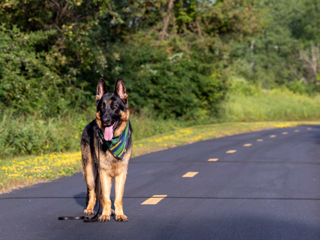
This image is by my friend Kristine featuring her German shepherd Reilly. The day was hot, the shot a quick one. Reilly is very regal. The leading lines in this image don’t quite work well. The dashes lead you out of the frame with the road, while Reilly’s eyes lead you out of the frame on the left.
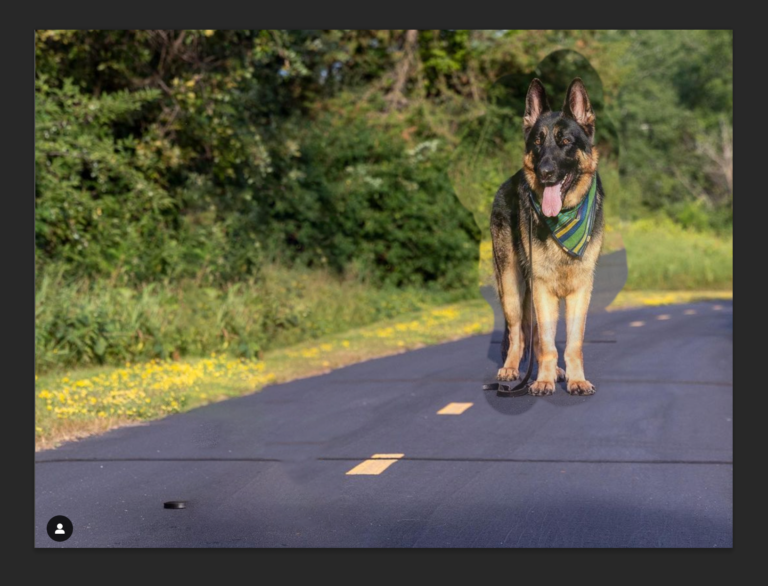
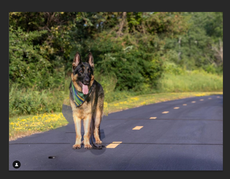
I did a couple of “dirty” edits to show her (and you) how different placement of Reilly within the frame would have changed the impact of the lines.
The first “dirty” edit shows a better placement of Reilly farther down the road so that the road and dashes lead to him. BAM! Instant impact with regal Reilly!
The second “dirty” edit merely has Reilly flipped. The impact is a bit more subtle, but his gaze leads you into the road and dashes that move out of the scene.
The general “rule” I have for dogs is to give more space in the direction they are looking. If they are looking to the left side of the frame, the dog should be positioned from the middle to the right of the frame. If they are looking right, they should be in the middle to the left of the frame. This gives the leading lines of the eyes some room to lead the viewer instead of just dropping them out of the frame.
Crazy how head placement or placement of a dog can make lines work or not work in an image!
More on lines!
Basically lines move from point A to point B. They can be straight, curved, diagonal, horizontal, vertical, organic, manmade, subtle, bold and implied.
- Horizontal lines. Typically found in the horizon of an image. They are calm, relaxed & static.
- Vertical lines. Lines that go from top to bottom instead of side to side. They imply power, strength and are dynamic.
- Diagonal lines. Lines that move on an angle within the image. They create movement, are dynamic and add tension to an image. Diagonals also create depth when they converge at a point.
- Curved lines. Lines that flow throughout an image. The classic example is a winding road in the mountains or a river that flows lazily across the landscape.
- Organic lines. Found in & made by nature. Trees, shells, animals, rocks etc.
- Manmade lines. Created & crafted by a human hand or machine. Fences, playgrounds, roads, bridges, and beyond.
- Implied lines. Lines that don’t physically exist but are implied. Frequently found in spaces between objects and in the direction of eyes. That dog sitting and looking up at something that makes everyone stop and look to see what the dog is looking at – that’s implied lines in motion.

Vertical lines! Both Blue & the gate to our fence! The edge of the sideway is a diagonal, and Blue’s eyes are implied diagonal lines. I have no idea what he was watching but it caught his attention solidly!

All the lines! Playgrounds have ample styles of lines! This playground has orange horizontal bars, plus orange curved bars. Dark green supports make chunky vertical lines, while the wood of the steps and platforms is horizontal… except when its viewed at different angles!
In fact, the shadowed lines between each wood plank lend to a ton of diagonals! Another diagonal is found in the steps for the slide in the background plus the shadow from one of the vertical green columns! Plus the angle change of the horizontal orange bar adds even more diagonals to the scene.
And we can’t forget the vertical lines of Blue when he’s in a sitting position!

Ample horizontal lines in this image of Blue! The sidewalk, the road, our fence and the edge of the garden along the fence! (And those rectangles of color? Spray painted repurposed picture frames!)
Not only are there strong horizontal lines, but a strong vertical line from Blue in a sit. Did you see the diagonal line of his tail?
Lines are great elements of composition that can lead your viewer’s eye into the image and to your subject. Additionally they can create depth, movement, and add or calm tension in your image. Used well, they will amp up your images. Used haphazardly, they can make your image weak and your viewer’s eye might just bypass what you want them to look at.
Huzzah for lines!
(Boo for hard to concoct blog titles!)
We’re in a blog ring of pet photographers around the world! Next up: Toronto based dog photographer Terri of Terri J Photography shares how to use the technique of leading lines to get better dog portraits.


Great post Cahlean, and love that we got an up-to-date sneak peek of Blue, he’s getting big! (oh, and how clever are those painted picture frames on the fence!)
So many lines at a playground – perfect spot for the topic! Blue is such a great little model -love him lying down with his head on the wood – such a cutie!!!